Wealth 42 -
a financial planning app
Reinventing financial planning
and risk assessment through an AI-based service to help individuals and families create wealth while fulfilling financial goals.

Overview
The founders of Wealth42 recruited me for a ten-day contract project to design an MVP. It was very fast-paced but a great learning experience to work cross-functionally on shipping a real product
Team
Prachi Garg (Interaction and UI Designer)
Ashutosh Dwivedi (Lead Developer),
Nitish Varma (Co-founder)
Role
My primary role was as a contract Interaction & UI designer where I was responsible for strategic consulting and designing the MVP.
Tools
Adobe XD, Marvel
Duration
1.5 weeks
Client
Wealth 42
PROBLEM
Investing is difficult for many people to wrap their heads around. People struggle with financial planning, unable to save enough for their retirement, nor generate timely wealth to fulfill short and long term goals.
Why is this a problem?
Disrupting a way of life
Some people in India spend all their life sticking to conventional choices for saving and generating wealth, informed by their loved ones like creating fixed deposits, bonds and not stepping out of their comfort zone, while millennials aren't able to make financially-aware decisions due to lack of knowledge.
DISCOVERY
Why do people struggle with this?
Nitish & Ashutosh (the co-founders) conducted qualitative research before I joined the team
to better understand their market. Although I wasn’t directly responsible for this part of the
project, I wanted to include a summary of the conclusions shared from the research
conducted as it informed my design process.
Based on their assumptions and later the findings, the main target audience came to be Gen Y individuals and affluent DIY investors, from which two main personas emerged -
1. users with no financial acumen or experience
2. users with limited experience, with existing investments.
While each demographic had slightly different motivations and needs, there were some underlying themes for pain points. →
User Painpoints 😭
📌 Too much information available making research to find the right investments difficult.
📌 Busy with life; lack of time to manage money.
📌 Financial decision making in itself is
harbinger of stress and anxiety
📌 Lack of awareness and trust prevents stepping out of one's comfort zone.
📌 Worried about making the wrong financial decision and losing money due to errors.
As the project scope was for a short duration we quickly mapped out our workflow which also involved me educating the founders about the significance and the process of user-centered design.
Due to the unavailability of the 8 interviewees when I joined, they weren't accessible to me so we had to proceed with the existing findings and design an MVP. The final design had to be submitted at the Y Combinator summit.
We followed the Double Diamond design process

Outlining the plan
First, get familiar with the world of investing!
Having less experience personally in financial planning and investing, I had no idea how the experience was for individual investors. I set out to learn as much as possible about the experience primarily on AI-based fin-tech platforms with a few research goals in mind
1. What is the current experience for individual investors?
2. What other robo-advisors exist on the market?
What did I learn? 🔍
Most Robo-advisors take two different approaches - Direct plan based vs Goal-based advice; although the underlying aim is to solve the same problem, of making investing and planning for retirement easier and less worrisome for all users.
The current user flow on Robo-Advisor services in India-
Onboarding → Profiling → Recommendations → Invest

Some Observations -
Direct plan based approach-
Complex questions part
of the lengthy profiling stage that a user may not understand or know the implications of, and of how it impacts their outcome.
Goal-based plan approach-
Quite simplified for the users and very understandable overall.
However, it lets you choose and shows you the result only based on a single long/short term
goal at a time.

Speaking to subject matter experts
We had a quick conversation with two mutual funds advisors to better understand the problem space and the bottlenecks known to experts in the field.
Users early in their career or with less money don't want to
pay for advice.
Personalization
is key to the users.
Most people haven't articulated
all their financial
goals
Users prefer accumulation over growth of their finances.
Advice from family, friends
or trusted source plays a great role
DEFINE
Who are our users?
Through the synthesis of the discovery phase we were able to establish that the MVP would primarily be for users with some investment experience and secondarily be for users with no experience as both had overlapping needs which created business opportunities.
Primary Persona
25 TO 40 YEARS OLD
MALE / FEMALE
SINGLE / ENGAGED / MARRIED
WORKING PROFESSIONALS
HOUSEHOLD INCOME 20 LAKHS & ABOVE
SOME INVESTMENT EXPERIENCE
Defining the user and business goals
It was important that we balanced both the user goals and business goals when designing rather than just evangelizing the user. In order to keep us on track, we outlined the user and business goals which helped us validate design decisions and decide which features and pages were most important to design, implement, and launch for the MVP.
User Goals ⛳️
📌 To take financial responsibility, self-directed investing style
📌 Use a trustworthy, non-invasive financial guidance online
📌 Parallelize long term and short term goals and plan accordingly
📌 Find maximum investment opportunities and mitigate risks
📌 Get continuous exploration of their entire portfolio
📌 To become financially independent early
Business Objectives 🎯
📌 To showcase the vision to secure startup funding for further business development.
📌 To design a MVP to test out with their target audience
📌 Receive feedback to fine-tune the B2C design strategy to better position oneself in the market.
📌 Create value for users by reducing decision fatigue.
📌 Find a solution to personalizing multiple goals-planning.
DESIGN
Key design considerations to keep in mind
Working for a real client for such a short time period came with its limitations, which pushed me to become a better problem solver. As a team we were actively brainstorming possibilities and streamlining the focus of the design strategy for the MVP but had to remember a key consideration at all times.
1
Feasible with the timeline.
Design ideas had to be uncomplicated enough for the developers to code well within the assigned timeframe. Also, it was essential to stay in line with the players in the market to avoid the learning curve.
Keep it simple
The main focus was to be on navigation and keeping each screen relevant and as uncluttered, which is often difficult in content heavy financial tools, to avoid confusing the user. The visuals also had to be kept at a bare minimum.
2
An iterative cycle of strategy, information architecture, testing and wireframing
A heavily iterative process as the founders were streamlining their business strategy while I was asked to start designing the screens. The quick timeline forced us to move very quickly from low to high fidelity mockups to better convey the designs.
Due to the unavailability of the research interviewees, we tested it amongst ourselves and 2 users outside of our research study participants.
_edited.jpg)
It was best to structure it on the same lines as the flow on other Robo advisors in the market to avoid burdening the user. That is -
Onboarding > Profiling > Recommendations > Invest
The user can go back at any stage in the app.
Task Flow
What are the core features of the MVP?
Financial
planning for
multiple goals
simultaneously
Reads bank statements & SMS to track inflows and payments
Bill reminder
for upcoming payments and collections due.
Uses Artificial intelligence to provide better suggestions which improve over time
Goal setup involves personalization based on time period and amount
Chat support
to resolve
issues
Initial wireframes and feedback
With this in mind, I began designing the wireframes of the few screens I felt were most essential to the app - Onboarding/ Profiling and Timeline. It was tested with the stakeholders and the 2 users to get quick feedback based on first impressions and visual representation and iterated accordingly.
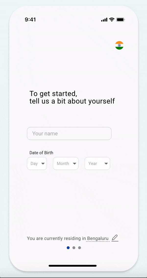
ONBOARDING / PROFILING


Clean and minimal
Both users preferred option 2. They found it easier on the eyes.
This was in contrast to our initial assumption that one scrollable page for all questions would provide comfort to the user for the chance of quickly screening all upcoming questions before choosing to answer them.
Option 1
One page scroll onboarding
Option 2
Three-step onboarding
TIMELINE
After onboarding, Timeline would the first touchpoint for the user on entering the app. We tested in accordance with the call to actions, feature positioning, and visual representation.

Iteration #1

Iteration #2
Brand design
Before starting with the high fidelity designs, I wanted to create visual guidelines, these were mainly aligned with the vision of the stakeholders and also to keep things consistent across all elements of the product.
Primary
Color
Alerts & Notifications
Positive Numericals
Negative Numericals
Typeface
Roboto
AaBbCcDdEeFfGgHhIiJjKkLlMmNn
OoPpQqRrSsTtUuVvWwXxYyZz
KEY SOLUTIONS
High Fidelity Wireframes and deliverables
Painpoints solved -
- Short onboarding flow to allow users to get quick access to the main app.
- Simple questions to prevent overwhelming users instead of ones they may not be comfortable answering just yet.
PROFILING
Visual representation & option to select multiple goals.
Painpoints solved
- For users who haven't thought through their life goals, visuals help in recognition vs recall.
- For users who have an idea,
multiple goal selection eases their understanding going forward to how finances are interconnected.
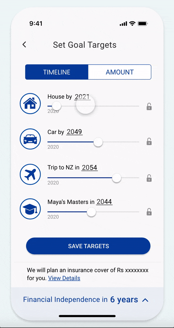
GOALS SELECTION

Time-based and amount based option of setting
details for the chosen goals.
Key Solution
- To allow users to personalize goal details
- To observe how the targets of each goal interchange and affect the other goals. The app auto-adjusts value based on its feasibility.
- Allows locking targets prioritized by the user for the
app to generate readings for the rest.
GOAL DETAILS
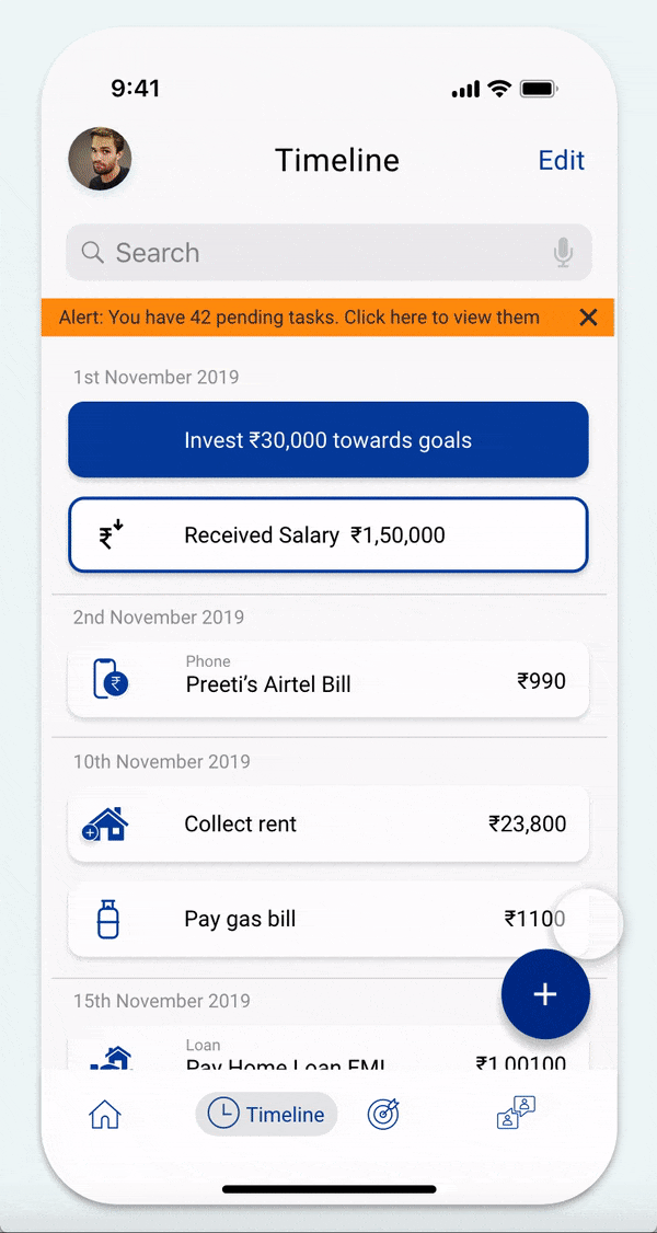
TIMELINE
- Tracks upcoming expenses and income as reminder cards
- (Invest) Directs the user towards making an investment
- (Salary) App suggests user confirm salary amount to improve its accuracy on fund suggestions
GOALS & PORTFOLIO- Overview of existing goals, investments, & liabilities. Money invested and potential growth
auto-calculated.
HOME
- Dashboard with tips and suggestions to help improve the user's money health and the app's suggestions.
INVEST - Funds with variations of risk profile and time period suggested for the user to choose from.


The app has gathered the basic information...what next?
REFLECTION
...if I had more time, I would
Restructure the content on goal details and funds page and try minimize the cognitive load for the users, especially ones with no investing experience.
Providing advice in itself was a design opportunity and I would have looked into it to help users decide on their risk profile first and understand its short and long term implications before having the app recommend funds to them.
Quick ideating and testing is the key to designing a MVP in time.
I wasn't aware of Lean UX and Design Sprints at the time of the project. If I had,
I would have recruited new users, tested heavily and iterated faster and let that feedback back my design suggestions and help us in moving forward.
What I learned?
How design strategy constantly evolves when working in small cross functional team
Balancing the needs of stakeholders who were also developers and observing how non-design disciplines influence continuous brainstorming that lead to design implementations was crucial to designing this in time.
P.S Wealth42 received the Y Combinator Startup School grant.